Feather Fall Postmortem
(This is a copy of the postmortem post on my coding blog. Since I only worked on it for a couple days I didn't keep any notes during the competition, and so this was all written yesterday night. It's also really long. Hopefully someone else finds it interesting.)I originally didn't intend to enter - especially after I lost half a tooth at the start of the week - but after coming up with an idea that it didn't look like anyone else was pursuing I put together a basic flight prototype. It was a particularly frustrating week at work so when I came home I felt like coding something of substance.
 I
think it's pretty good for the 10 hours of coding and 2-3 hours of art
we put in. I don't think we've had any of the usual bugs which plague
PyWeek entries like dependency hell, weird OpenGL bugs, or crashes in
untested code paths. We kept the game simple and focused and made sure
there was plenty of time for testing.
I
think it's pretty good for the 10 hours of coding and 2-3 hours of art
we put in. I don't think we've had any of the usual bugs which plague
PyWeek entries like dependency hell, weird OpenGL bugs, or crashes in
untested code paths. We kept the game simple and focused and made sure
there was plenty of time for testing.Controls
Feather Fall started as a controls prototype. Making flying feel really good was my main priority; all the game mechanics came later. Playing other PyWeek entries is sometimes frustrating for me. The controls are twitchy or unresponsive even in otherwise great games. So I think having our controls feel really good, even given shallow mechanics, made our entry stand out a bit.
The goal was to give the player an interface suggesting they might actually have to adjust two rotors strapped to their sides. The original version used an Xbox 360 controller but since not everyone would have that I switched to a keyboard. Placing the controls on opposite sides requires you to use both hands and using space for acceleration made it feel like a "big" action.
This is where it sat until Thursday/Friday, when I threw in the obstacle generator to add some challenge and the score counter to make it a game. Layer was incredibly useful during the early control tweaking stage. It's easy to add new entity control bits and the real-time physics constant tweaking let me hone quickly in on the behavior I wanted.
Level Generation
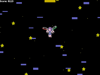
Since we didn't have any time levels are generated randomly with a trick stolen from Passage (in retrospect the scoring mechanics are very much a vertical version of Passage, although the controls are nothing alike). As you go up the obstacles get denser; as you go further from the origin they get more chaotic in size.
Jessica suggested picking up coins as a mechanic in addition to flying fast and far. It was easy to implement since I already had code for generating an infinite area of platforms and it made the initial flight up more interesting. It also increased the temptation to fly so long you ran out of fuel, hoping to compensate with more coins.
Last Minute Changes
Jessica and I had a disagreement about the game's scale for most of the development. She wanted a bigger main character that moves slower (in pixels/second) and I wanted a tiny player who moved fast with a larger visible game world. She drew the art, so she won. There were a number of hacks in the collision code to account for this (we didn't make the player bigger on the physics side - we made the obstacles invisibly larger). It still plays well and I think the scoring is balanced. However the obstacles are packed too densely too soon, so reaching the ground safely is an enormous score bonus.
One of the dumbest things I wrote was a failure to multiply the velocity by dt to generate the next position for the frame. Because the game ran at a stable 60fps for me I hadn't noticed, and since some of the factors were getting multiplied I didn't notice. Since the input to the acceleration comes from a total of 6 factors, the quickest fix was to dt *= 60 before handling the velocity. Whoops. In the end the physics felt fine, but the motion equations are the biggest embarrassment in the code. There were a number of other stupid but harmless problems in that code.
The Help Screen
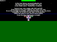
 I think my biggest success was the tutorial / help screen. Since we
have a unique control scheme I wanted to make sure people at least knew
what keys to press. I placed a starting line a bit above the player and
made the game not really matter until the player passed it as well as a
wall of text. You can test changing rotor angles and hopping around
before you actually take off the first time. If you've played the game
before, you can just hit space and take off and ignore it.
I think my biggest success was the tutorial / help screen. Since we
have a unique control scheme I wanted to make sure people at least knew
what keys to press. I placed a starting line a bit above the player and
made the game not really matter until the player passed it as well as a
wall of text. You can test changing rotor angles and hopping around
before you actually take off the first time. If you've played the game
before, you can just hit space and take off and ignore it.I'm not sure anyone has turned to our README.txt for controls, which is a win in my book (especially compared to some other PyWeek entries). We'll be shrinking or somehow changing the text in the future (probably making it a real main menu). It's too much for a non-PyWeek game.
Future Work
I've already done some major refactoring and cleanup of the project to account for the crap code written in the last couple hours of the competition, and to let us do some minor variations in the game mechanics. We'll probably submit it for Pyggy and definitely put a more final version on the Yukkuri Games site.
(log in to comment)
Comments
By the controls being good, I mean there's a quick and consistent response to each input. There's a difference between the controls being good, and making it easy to get where you're trying to go. (Contra is a good example of a game with very good controls but it's incredibly difficult to even cross the first three screens.)
As an example of bad controls in otherwise excellent games, Abbey's Grand Adventure - if you hold down space, you keep jumping, rather than jumping each time you press space. Thus pressing space sometimes jumps once, and sometimes jumps twice. Another example would the digital movement and no camera control in After the Fall, which takes place in an analog world.
Thanks for the feedback. I agree that it's very difficult to get back to the ground. It's surprising to me how many people see that, rather than the score, as the goal. I think the score is balanced to take that difficulty into account, but the visceral reward of reaching the ground again seems to outweigh trying to get the score to go up. I'm definitely going to take that into account while rebalancing it. If the game design encourages a particular play style, the rewards need to reflect that too.
I agree that it's very difficult to get back to the ground. It's
surprising to me how many people see that, rather than the score, as
the goal.
Probably because in real life, it wouldn't much use collecting a lot of gold out of the sky if you didn't make it back to the ground in one piece to enjoy it, and it's hard to let go of that feeling.
As for the controls, there doesn't seem to be any logical reason for having two independently-swivellable rotors -- it just seems like a device for artificially making the game harder, which I don't find very satisfying.
 cyhawk on
2009/09/11 18:32:
If you think the controls feel "really good" in this game, could you point out a few examples for comparison where they are "twitchy or unresponsive"? :)I thought this game had one of the most awkward control schemes — which is not necessarily a bad thing! In my opinion the controls are quite a challenge here, and it is fun just trying to move where you want to. I did not enjoy the game very much in the end, because avoiding the obstacles is also a rather big challenge, and the two are too much together. But if the obstacles were easier, the controls would make for an interesting exercise, and vice versa if the controls were easier to master, avoiding the obstacles might be fun.
I just find it interesting that you would think of the controls as something that feels good.